Friday 8 May 2009

Studio AKA


Studio AKA

Another company we visited in London was Studio AKA. They are one of the counties top animation companies. There client list is extremely impressive it includes, Llyods TSB, ITV, BMW, H Samuel, and Peperami. We watch their newest film which has been created purely to promote the work they do at the studio. It is called Varmints and is probably the spectacular animation I have watch in ages. Its very aestheticly drawing, and the story is amazing. Its based on a book written and illustrated by one of the directors who works at Studio AKA. The story is very dark and is defiantly not aimed at children, and shows that animation isn't just a colourful kids medium, its a series medium to tell a story.

Double Negative


Double Negative

When we went to London we were lucky enough to take a trip into one of the worlds leading visual FX companies, Double Negative. I have been watching DN's work for a while now as visual effects in films has always interested me since I watched Jurassic Park for the first time in 1993. Jurassic park contained the first photo realistic characters in a feature length film. Since that I have been avidly looking at all different types of visual effects and it didn't take me long to come across Double Negative.


When we went into the see them I was really surprised at the size of the place, the girl who was taking us round said they employed over 500 people there. This sounds a lot but when you consider the size of the briefs they get assigned you can understand why they have that many people working their.


Walking round the building we saw room after room of computer filled offices all with five to seven people in them all with Maya on the their screens. We also got to the rendering farm, which was HUGE. They also showed us their show reel and then a in depth video explaining the work they did on the Dark Knight, a film that I had watch a lot recently and was in ore of the work involved in it. So to see scenes pulled apart and explained to us was amazing. One of the things that I had never picked up on was the amount of work that is done in the background of scenes, There are so many scenes in the city of Gothem, that you would believe were real if you weren't shown differently.


The Sancho Plan

The Sancho Plan is a live performance show involving animation and the use of Midi instruments to trigger visuals and sound. I found this really amazing not just because it looks brilliant but because I've worked a bit with Midi triggering I can appreciate the amount of time it has taken and the amount of ingenuity to get everything to work together as one. I love the way they have thought about bringing something to an audience that isn't just music or its just watching a film, the combination of the two is incredible and a really creative way to engage a audience. Added to that, its all 'played' live by hitting electric drums makes it even more original.

See the web site Here

Tal Rosner Vs Tracey Kendall

Tal Rosner Vs Tracey Kendall

For the comparison to tow practitioners I have chosen Motion Graphics artist and designer Tal Rosner and Textiles and Space Artist Tracy Kendall. My reason for choosing these two is that they come from complete opposite ends of the create world more of less.
To begin with I think it is important to say that both people come from not to dis similar backgrounds. They had a love of art and perused this by taking a coarse at a art college. This seems to be the beginning of a lot of designers and defiantly a starting sentence from nearly all the guest lectures we have had visit us at Stockport.
One thing to bare in mind at the stage is the age difference between Tal and Tracy. Tracy is a fair bit older than Tal had and started creating and deigning way before Tal's medium even existed. This fact alone already starts picking out the differences between the two and it goes to show that Art and Design coarse have been around for years but its what's current and fresh that has an effect on what new designers will become. Who's to say that if computer technology was what is today when Tracy was studying she might have been a motion graphics artist like Tal.
Comparing someone who makes abstract films to a world class wallpaper designer may seem a little strange as there are a lot of differences between the two and they do seem a world apart. However there are lot of similarities as well within their work.
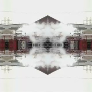
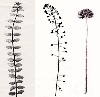
Tal films the world around him, searching and looking for interesting visual statements with the urban environment in which we inhabit. He goes to the most depressing and mundane places within the urban sprawl of London and find the most amazing visuals. It's only when you take something out of its original context and apply it to something new like Tal does, does it take new and exciting meaning. Tracy as well works in a not to different way. She takes not photos and footage but items themselves, real objects considered to be boring or not important. Taking these and reapplying them to a wallpaper design, all the objects work together as one visual message that is much more than just buttons glued on paper, or in Tal's case footage of a industrial estate. Through their creative process however different their idea and ethos I think remains very similar.
Another thing to consider when talking about Tal and Tracy's work is the colour pallet used by both of them. In Tracy's lecture she mentions that she used black and white a lot as it is a masculine colour and as nearly all the architectures and clients she has buying and looking at her work, it makes sense to her to appeal to them. If we take that idea and look at some of Tal's work Such as Doppelgänger then we see that minimalist approach to colour, is for a design or is a built in appeal for men to like those colours and therefore use them and find them visually pleasing.


This leads me onto to their working practice in regards to clients and running a business and at the end of the day how make money. Tracy clearly loves what she does as not only does she just create her wallpapers for purely commercial purposes but she exhibits them as art in galleries. However underling this the fact that what she does make is sold for massive amount s money, and she did quote some figures in the lecture which were jaw dropping. It makes me wonder if she wasn't making the amount of money she does would she have another job and still push her wall paper as art. My thoughts are that she wouldn't, Tracy came across in the lecture as having a very instinctive business mind, and talked lot of about her clients and sub contractors leaning me to think at least that she runs a very successfully company and turns a good profit, however I do think she thinks of her wallpaper more as a job than a creative release.
On the other hand Tal is the opposite. To peruse what he wanted to do he had to leave a well paid job in post production and take a gamble on his own ideas and he very much treats hid work as personal projects in which he can pour is style and creativity into, no matter how big or small the client or if there isn't a client at all. Tal came across in his lecture as a very reserved character, he didn't say a great deal but what he did say was very insightful. He draws you in as being this enigma that everyone wants to understand and get inside his head, but I doubt he even shares his creative secrets with his closest friends. For Tal taking a chance and producing the work he wants and gaining complete creative control (apart from the clients decisions) has paid off, and he now creates the work he loves and earns money for it. Not only that he has done work for some very large clients such as channel 4. Tracy as well has achieved that great position in life where your doing what you love and getting paid for it. I think with Tracy the client comes first and she is always thinking of new ways to get her product out there, and she genuinely enjoys every aspect of her work.
Both Tracy and Tal have done what I think every student dreams of doing..... exactly what they want and getting paid for it, and I think they have proven that anyone can do it no matter what your speciality is as long as your demerited and put the work in.

Wednesday 6 May 2009

Funnel design group


This a design company I found on the web, and I wasnt that interested in their work, what was overwheled by the creative, interactive and original web site they have.

Thery're based in the US and deal with Print based graphics, interactive web sites (oviosly) coorperate identitys and much more.

The web site really draws you into it, with the use of nostalgic colours and textures and 1940s music. All this in mind it doesn't seem dated.

Thje site is a nice refreshment from all the super slick minamalistic web pages that design companies usualy have.

Which can be found Here

Grant Gillbert


Grant Gillbert is a motion graphics artist who we were lucky enough to have as a lecturer this year.

He started out doing the same coarse as I did a ND in graphics at Stockport College then moved to Birmingham to do his degree. His fist job career wise was on Channel 4 creating title sequences and promo/bumpers. He spent a short time in New York until coming back to go freelance in this country which he has continued to presume till this day under the name of Double G Studios.

Unlike a lot of freelancers Grant owns Double G Studios as a LTD business which is a interesting and more professional way of setting your self up as a freelancer, rather than just using your own name.

However when I visited Main Frame in London, my class mates and I were advised against using a company name for yourself if you are planning to try and get work in a larger company. It's something that thought to take note as the current economic climate doesn't allow for business mistakes, no matter how good your work is.

Back to Grants work, I found his list of clients very impressive and the work that that he produced even more so. It was nice to see a small company getting big clients and the work still looking top notch.

Tuesday 5 May 2009

Serial Cut

I found this image making company using the trusty 'Stubble'' button again. They get commissioned to create there own style of super slick graphical imagery for a variety of clients.

This is one of there newest pieces. It's a pop up book created for Renfe’s new campaign advertising there brand new fleet of trains. What is nice about this image is that it actually exists there's no 3D or Photoshop its acutely been made then photographed in a studio.

I always get a bit of a kick when I know some thing has been done for real, such as the Sony Brava adverts with the plasticine rabbits. This is on a much smaller scale but it's still nice to know that the computer does get left of the equation sometimes.


This is a motion graphics piece for the 2009 MTV winter events. I really like the smoothness and the use of space in this little animation. The lack of things going on really makes it flow, rather than a really in your face over the top piece of motion Graphics.