Friday, 19 December 2008
Portfolio crit in January
Monday, 27 October 2008
DDB - Paris

THE COMPANY WEBSITE
I found this company via a short film a discovered on YouTube.
The company website is some what difficult to navigate as I don't speak a word of French. However, with some trial and Error clicking I did finally get into there Portfolio.
They are prieraly a motion graphics company, who deals with lots of major brand names, creating adverts for the French TV networks.
There clients include Audi/Volkswagen/MTV/Nike and Channel to name but a few. I watched a few of the adverts and shorts they have done and I'm really impressed by the slickness of ALL there creations.
The Volkswagen advert impressed me a lot, as they are very funny, and very well thought out for the target audience. As I said I can't speak any French but I can guess that the strap line at the end is explain the practicality of the VW van.
Back to the reason I found this company. The Short animation entitled ' La Ballon'.
This is one of the most pleasant things to watch I've seen in a long time. The simple aesthetic of the animation makes it really easy on the eyes.
The character which in the sense of it, isn't even alive at (The Balloon) you find yourself feeling sorry for it and caring about what happens to it, and therefore can't stop watching it.
However the best thing about this piece is the ending, where the ballon floats up into space and ends up with all the other balloons that have been 'let go of' at the ceiling of space.
Another excellent thing about this animation is the sound track. I think the depth of the song, the build ups, the dynamics of loud and quiet in the orchestra really support the emotion of the film. Without the sounds track I think the short wouldn't be as effective as it is. One of these key moments is when the Balloon goes floats through a storm and the sounds track makes you feel the storm not just see it.
The Simpsons Made in S. Korea?

I was researching for my Critical Journal and came across I Chinese news site. The article that caught my eye was 'The Simpsons Made in S. Korea'.
Read the Article Here
This I had to read. I already new that big animation studios export bulky work to other countries to save on laubour cost. However this article opened my eyes even further.
The article discuss a visit the author had to a studio in South Korea called AKOM Production Co. This is where from the first time 'The Simpsons' premièred as a TV 'series' 1989 it has been produced.
This at first didn't shock me as I presumed a lot of the work for the Simpsons must be done outside the US, However as I read on it wasn't just some of the work, it was ALL of it.
The Article details the manor in which the creation of a Simpsons episode happens from the point of view of AKOM Production.
They receive a Storyboard (a detailed one of coarse), camera directions, colour pallets and the early sounds tracks and in three months have to deliver the animation.
Of coarse all the finishing touches and post production are still done in the US but the artistry of the animations is all carries out by AKOM.
Akom themselves seem very proud of the work they do, and as we have all seen it isn't shoddy work by any standard. However I can't help but think that maybe AKOM and it's team of 122 Korean animators are blissfully unaware of the capital success of Matt Groaning's dysfunctional Yellow family.

Thursday, 23 October 2008
Tex Avery
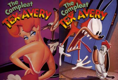
Tex Avery
In my opinion the father of the modern day cartoon.
I came across him whilst researching for my self-directed project. I was following the story of Hollywood's golden age of animation. After reading about Disney I found it to be very impressive technically and I have great respect for the animators, I didn't really get inspired and exited about it.
However when I discovered Tex Avery's work, and more impressively his attitude to animating and I was blown away.
I loved the way he thought about his cartoons, his attitude was why create realism in something that isn’t real. Watching a documentary on the life of Tex, some of his ex employees spoke of him always trying to ensure the audience never forgets there watching a motion picture.
This comes through very obviously at the beginning of one of his early cartoons, ‘Red Hot Riding Hood’.
you can watch the short Here
At the beginning the tale of ‘little red ridding hood’ starts out as you may expect, until the wolf interrupts the narrator, shortly joined by the rest of the characters all demands a different angle on the story just like a bunch of artistically restricted actors. The story then begins again within the setting of the New York Nightlife. Little Red Riding Hood is a strip tease, the Wolf is a successful businessman on a night out, and grandma is a nymphomaniac.
The story deals with sex, lust, violence, suicide, irony and delivers real humour to the gags because non of them are possible in real life.
Tex's 'attitude' towards animation is also shown in a screwy the Squirrel cartoon.
This can be Found Here
In this short, Tex couldn't have mad a more direct dig towards Disney's style and philosophy. The most clear and apparent thing about this is the difference in style between a Disney squirrel and Tex's. Tex's squirrel then goes on to beat up the cute, fluffy, friendly Disney squirrel to the delight of the audience.
Tex is famed for many famous characters, including Bugs Bunny, Droopy, Red, the wolf and many nameless but instantly recognisable faces.

Monday, 15 September 2008
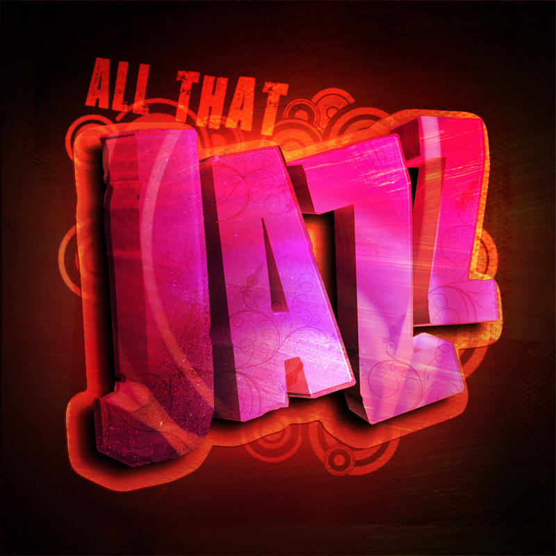
All That Jazz
Well here we are my first blog, and its about what I've been up to on my day off.
I was browsing through the Internet using a new Firefox Ad-On called ''Stumble''. You basically fill in your interests and click stubble and it takes you to related web pages which you wouldn't normally come across. (Cheers Jordan for telling us about that one.)
I ended up on www.shinybinary.com, which is the online portfolio of Nicholas Ainley. I had a look through his work and to be fair to him there isn't a bad piece on there. However my eyes were caught by the first couple of text based pieces.
I've been playing this ''graffiti'' inspired style on a few things over the summer, trying to get a feel for how to produce it and the techniques involved but that's all been 2D based work. What I like here was the inclusion of 3D and 2D elements.
So I thought I'd have a crack at it myself. I new I would need to get a model of some 3D text, which at first I was going to render out and the edit in photoshop. But then I remembered reading about the new 3D layer and object tools in Photoshop Extended. These enable you to import OBJ files into Photoshop.
 So I set about finding a nice font, and writing the word Jazz. (Only for the reason, Jazz it a very expressive type of music and therefore could be visualy interstinginteresting, also the song that I was listening to at the time was ''All That Jazz'' by DJ Fresh :)
 I then converted into a Illustrator path and imported it into Maya. Once in Maya I turned the curves into a polygon. Changed the angle and size of the letters to create more dynamics. At this point I had to find a plug-in so that I could export the model to a OBJ format. I found one of those Here for FREE !
 Once I had the model I jumped onto adobe's video tutorial site and looked at the a video on the
new 3D features so I didn't miss anything. I then went ahead and and imported the model into photoshop.
Once I had it in photshop you can select the new 3D layer tool and manipulate the model in 3D space add, light and choose the render display mode, all whilst working with the familiar tools off photoshop.
 I repositioned the model to where I wanted it and began work on bringing it to life. I applied the
first bit of colouring by selecting each letter and painting with a paint spray brush from computer arts magazine. I then duplicated the letters and shrunk them etch, to create the illusion of a glass like material. I also made sure that each letter was now on a different layer just to maximise my options.
 After I had the text looking the way I wanted it to, I began work on the background. This consisted of a black with a centre gradient of light yellow. Then above everything was a layer with grimy brushes strokes on it which was coloured and then set to ''overlay'' this gives the image that Mediterranean warmth.
 Another couple of textured layers were added in a similar way to give the image more depth. Then some light swirls were projected onto the text as well with some textured canvas underneath it all.
 Again a few more light layers were added and some subtle highlighting and shading. Behind the text I added a collection of swirls and circles I'd drawn in illustrator, then converted into Photoshop brushes. Also on the text itself I applied small ornate decoration, containg flowers and swirls. These were all cut to the shape of the letters and set to ''overlay''.
Finally I added the text ''ALL THAT'' (like the song) and a outer glow/shadow created by duplicating the text, filling it and reshaping it.

You can find a bigger version Here.