Showing posts with label Research. Show all posts

Friday, 8 May 2009

Studio AKA


Studio AKA

Another company we visited in London was Studio AKA. They are one of the counties top animation companies. There client list is extremely impressive it includes, Llyods TSB, ITV, BMW, H Samuel, and Peperami. We watch their newest film which has been created purely to promote the work they do at the studio. It is called Varmints and is probably the spectacular animation I have watch in ages. Its very aestheticly drawing, and the story is amazing. Its based on a book written and illustrated by one of the directors who works at Studio AKA. The story is very dark and is defiantly not aimed at children, and shows that animation isn't just a colourful kids medium, its a series medium to tell a story.

Double Negative


Double Negative

When we went to London we were lucky enough to take a trip into one of the worlds leading visual FX companies, Double Negative. I have been watching DN's work for a while now as visual effects in films has always interested me since I watched Jurassic Park for the first time in 1993. Jurassic park contained the first photo realistic characters in a feature length film. Since that I have been avidly looking at all different types of visual effects and it didn't take me long to come across Double Negative.


When we went into the see them I was really surprised at the size of the place, the girl who was taking us round said they employed over 500 people there. This sounds a lot but when you consider the size of the briefs they get assigned you can understand why they have that many people working their.


Walking round the building we saw room after room of computer filled offices all with five to seven people in them all with Maya on the their screens. We also got to the rendering farm, which was HUGE. They also showed us their show reel and then a in depth video explaining the work they did on the Dark Knight, a film that I had watch a lot recently and was in ore of the work involved in it. So to see scenes pulled apart and explained to us was amazing. One of the things that I had never picked up on was the amount of work that is done in the background of scenes, There are so many scenes in the city of Gothem, that you would believe were real if you weren't shown differently.


The Sancho Plan

The Sancho Plan is a live performance show involving animation and the use of Midi instruments to trigger visuals and sound. I found this really amazing not just because it looks brilliant but because I've worked a bit with Midi triggering I can appreciate the amount of time it has taken and the amount of ingenuity to get everything to work together as one. I love the way they have thought about bringing something to an audience that isn't just music or its just watching a film, the combination of the two is incredible and a really creative way to engage a audience. Added to that, its all 'played' live by hitting electric drums makes it even more original.

See the web site Here

Tuesday, 5 May 2009

Serial Cut

I found this image making company using the trusty 'Stubble'' button again. They get commissioned to create there own style of super slick graphical imagery for a variety of clients.

This is one of there newest pieces. It's a pop up book created for Renfe’s new campaign advertising there brand new fleet of trains. What is nice about this image is that it actually exists there's no 3D or Photoshop its acutely been made then photographed in a studio.

I always get a bit of a kick when I know some thing has been done for real, such as the Sony Brava adverts with the plasticine rabbits. This is on a much smaller scale but it's still nice to know that the computer does get left of the equation sometimes.


This is a motion graphics piece for the 2009 MTV winter events. I really like the smoothness and the use of space in this little animation. The lack of things going on really makes it flow, rather than a really in your face over the top piece of motion Graphics.


Feist, 1, 2, 3, 4

This is a small budget music video I came across directed by Patrick daughters. The look of the video does seem a bit cheap and nasty at the beginning but as the video progresses you get drawn in by this continuous camera shot with know edits. It just follows some really well organised coriography.


Lynn Fox - Audi ''Lines''

I came accross director Lynn Fox's work on the website for a campany called BlunkProductions

Blink productions are as the name suggests, a production company. They are based in London and work in a very similar way to Studio AKA, where they have lots of directors all with different talents and styles who are located different projects depending on what the client wants.

This is one of my favourite adverts in the last few years. just plainly because of its simplicity. I really think the idea of the advert works especially well due to its simplicity.


Seven Deadly Glasses

Seven Deadly Glasses


I found these glasses on a design news site called Yatzer.com. They are designed by Kacper Hamilton and based around the theme of the Seven Deadly sins

What caught my eye is the way the designer has captured the idea of each sin in each glass. It's clear they have really thought about how to portray the sin through the shape of the glass.

To see bigger pics click Here

Nozon


Nozon are a Visual FX and Animation company from Brussels. They have a broad range of work as the show reel below demonstrates. They are a one of Europes best new and upcoming studio and what I like peticularly is the quality of the character animation.

The aesthetics in the Hamster animation is easily as good as a pixar short and their visual FX work is world class.

See the Website Here

Shy the Sun


Shy The Sun are a slightly off the wall motion graphics and animation company from South Africa. They are only three strong but just like Dvien create very impressive work with very few people. What caught my eye about them was unusual look and appearance of there work. There mythological influences are very evident.

Being musically backgrounded I found this piece 'Sea Orchestra' very interesting. I love the way they have brought out the moment of the notes within the animation and the style is like that of a old painting that has been brought to life.

Tuesday, 28 April 2009

Subprime by Mike Winkelmann

Mike Winkelmann is currently a graphic designer from the US, I found this animation searching Vimeo. I like that it reflects current issues in the USA concerning the housing market. Also the influence from pixel art is very clear and the way it as been brought to like is very effective.

The music was created by a sound design company called Standing Wave
they are a sound company that specialises in creating digital based production music for a variety of applications.

I think they were chosen for this animation as the minimalistic digital music compliments the simple aesthetics of the animation.


subprime from beeple on Vimeo.

Studio Liddel


See the Website Here

Studio Liddel are a animation company based in Manchester. I first heard of these guys through a friend who said I could have some work experience there. Unfortunately she is very ill at the moment so I going to wait till she gets better before I reminder her about it.

What attracts me to Liddel is the range of 3D work they under take. It goes from Children's TV's cartoons to hype realistic design work. Another big part of there work which I'm interested in as something I wouldn't mind doing in regards to freelance work is 3D visualisations of buildings, events, products etc.

They are also involved in various pieces of graphics work, which is usually related to the animation work they do.


Thursday, 16 April 2009

Dvein


Dvien are a motion graphics and interactive company in Barcelona which upon my visit there in November I had the fortune to go and see.

They have a large client list and are highly regarded world wide as one of the best in there field, which is a an amazing thing considering there is only a couple of them working there.

On the visit I found the attitude was really relaxed and informal, taking into account the jobs that they do there this was surprising to me as I thought the amount of pressure on such a small company would be evident.

We were given a talk about the what they do, there company ethos and the reason they wanted to set up the company in first place.

I found this little piece of text in there 'about' section on the web site.

''We love animation, we love design, we love illustration, we love coding, photography, film making, modelling, drawing, painting, cooking, sewing, sleeping, gaming and lots more*ings*


I think this sums up the company very well as there influences come from all over yet the studio defiantly has its own 'in house' style.

We also got to see there show reel as well, which was stunning and one of the few show reels that I have seen which a piece of audio specificly designed for it. This resulted in the Show reel being a piece of work in it's self that captivates you with all these amazing visuals.


One of the things that I was surprised at was the method in which they storyboarded things and came up with ideas. We were show a first story board that contained frames that were used in the end product, resulting in the storyboards themselves being finished to a very high standard. This is in very stark contrast to the way I work or the way I have seen others work.

One of the things that caught my attention about Dvein's work was the fluid aspects. This was mentioned in the talk and we were told about how they experimented with melting plastic and wax to create there footage and effects. So when I got back I had a go my self with a heat gun and a collection of plastic bags.

Here is a couple of examples of what I came up with


Dvein's webpage can be found here

Tuesday, 24 February 2009

Photoshop Lighting Effects

Pete Harrison

I recently came across a tutorial from an artist who I had already heard of and admired called Pete Harrison. The tutorial apparently appeared in Digital Art Magazine but I found it HERE on there webpage.

The end result of the tutorial was this.


So I searched out some stock photography from Deviant art and began following the general idea of the process evolved, still interoperating in my own ideas and techniques I already learnt.

Before


After


To See larger Click HERE


I am going to continue with other such tutorials as I believe I am gaining valuable skills that I might one day use in my own work. I the case of this one it ended up on a poster.


To see larger Click HERE

British Gas TV Advert 'planet earth'

British Gas TV Advert 'planet earth'


See the video HERE

I saw the new British Gas advert the other day and it stood out to me immeadetly as I have been on the look out for adverts and campaigns that are answered in the medium of animation to support research work in my final major project.

The advert is promoting the involvement of British Gas in trying to use renewable energy sources as a means or generating power.(baring in mind you can now get your electricity from them as well as gas)

I think the advert has been created as a animation to try and make a pretty dull company and concept more appealing to a younger audience, perhaps first time home owners who have a more fresh opinion on saving the planet than a couple in their 70s. British Gas has used animation before with their 'Blue Flame' characters. (Below)for a similar I suspect.


My favourite part about the whole advert is the process in which it has been produced. I have a keen interest in 'model making' or 'scale set design/construction' this came from my love of Aardman Animation's work and Tim Burton's 'The Corpse Bride'.

Director Guilherme Marcondes had all of the set made from hand and suspended in front of a green screen.


The Wind Mill planet made by animating clay.


Filming the models with the special Stop-Motion 35mm cameras.

Monday, 23 February 2009

Karni & Saul

Karni & Saul a creative team, and couple. Saul is originally an animator/director, and Karni a photographer/director. They are based in London and have been working together since 2004.

All their work has a very distinct style. It's very grimy and dirty aesthetically and has some real raw qualities. Looking through their portfolio there are two pieces of work that stand out to be more unique than the other ones.

The first one is called 'Float' and it is a music video for a Irish/American Celtic Punk band called Flogging Molly.


What I like about this is the motion and rhythm carried and portrayed through the movement of the character. The way in which it depicts the lyrics of the songs is also very unique as it doesn't do it directly, it just hints at it.

The second is called 'The Red Suitcase' which for me is all about the brilliant narration of the story by the voice over. The stylised world the characters are in really appeals to me as well. Like the first one it has a grimy dirty look to it even though it is 3D, which is generally associated with slick looking animation.

999 Design


See the website


999 Design are based in three location across the country, London, Manchester and Glasgow. I have known about the company since before starting college as my Father used to freelance for them. As a result of this I always have had the opportunity to see what there working on before the public sees it, and taking into account there client list (Below) this is always very interesting.


In my second year I contacted two of there employees in the Manchester branch in Deans gate locks as part of my log book reports. Dave Sedgwick, designer and James Buckley senior designer. They were extremely helpful in filling out a short questionnaire I sent them and it was an interesting insight into the minds of two successful designers.

Since then I have have kept an eye on there work and these are a couple of pieces I really think have some really nice ideas behind them.

Gleneagles Natural Mineral Water


This is a piece or product packaging done for Gleneagles Natural Mineral Water. Not only is the bottle a beautiful slick ergonomic design but the whole thing is completed by the minimalistic logo. I love they way the the bottom of the 'G' ripples like water giving the logo a real visual taste of the product. The shapes and colours all conertate ideas of freshness and purity.

What About Me? Website

This project was to create a website for a TV show called 'What about me?'. It consists of two musicians going round the world and recording a song by taking a piece of music or a beat to a person and saying now add your bit, the continuing this process all around the globe. It takes them on journey in which they discover the worlds issues and problems all represented and dealt with by musical talent from every background.


See the site here

What I like about this website is the unity of the world that is represented by the interface, of giant world made up from a series of TV screens. The way in which the screens interact with the curser is also very inviting as is the ever changing content of the 'unclickable' screens.

It is a very easy website to use and has a lot of content if you want it or less if you just want to get an idea of what 'what about me?' is all about.

Monday, 27 October 2008

DDB - Paris


THE COMPANY WEBSITE

I found this company via a short film a discovered on YouTube.

The company website is some what difficult to navigate as I don't speak a word of French. However, with some trial and Error clicking I did finally get into there Portfolio.

They are prieraly a motion graphics company, who deals with lots of major brand names, creating adverts for the French TV networks.

There clients include Audi/Volkswagen/MTV/Nike and Channel to name but a few. I watched a few of the adverts and shorts they have done and I'm really impressed by the slickness of ALL there creations.
The Volkswagen advert impressed me a lot, as they are very funny, and very well thought out for the target audience. As I said I can't speak any French but I can guess that the strap line at the end is explain the practicality of the VW van.
Back to the reason I found this company. The Short animation entitled ' La Ballon'.


Le ballon
Uploaded by ddbparis


This is one of the most pleasant things to watch I've seen in a long time. The simple aesthetic of the animation makes it really easy on the eyes.

The character which in the sense of it, isn't even alive at (The Balloon) you find yourself feeling sorry for it and caring about what happens to it, and therefore can't stop watching it.

However the best thing about this piece is the ending, where the ballon floats up into space and ends up with all the other balloons that have been 'let go of' at the ceiling of space.

Another excellent thing about this animation is the sound track. I think the depth of the song, the build ups, the dynamics of loud and quiet in the orchestra really support the emotion of the film. Without the sounds track I think the short wouldn't be as effective as it is. One of these key moments is when the Balloon goes floats through a storm and the sounds track makes you feel the storm not just see it.

Thursday, 23 October 2008

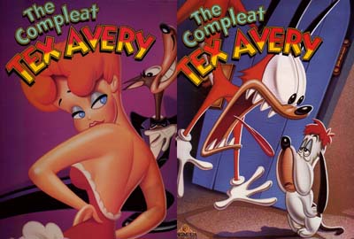
Tex Avery


Tex Avery

In my opinion the father of the modern day cartoon.
I came across him whilst researching for my self-directed project. I was following the story of Hollywood's golden age of animation. After reading about Disney I found it to be very impressive technically and I have great respect for the animators, I didn't really get inspired and exited about it.

However when I discovered Tex Avery's work, and more impressively his attitude to animating and I was blown away.
I loved the way he thought about his cartoons, his attitude was why create realism in something that isn’t real. Watching a documentary on the life of Tex, some of his ex employees spoke of him always trying to ensure the audience never forgets there watching a motion picture.

This comes through very obviously at the beginning of one of his early cartoons, ‘Red Hot Riding Hood’.

you can watch the short Here

At the beginning the tale of ‘little red ridding hood’ starts out as you may expect, until the wolf interrupts the narrator, shortly joined by the rest of the characters all demands a different angle on the story just like a bunch of artistically restricted actors. The story then begins again within the setting of the New York Nightlife. Little Red Riding Hood is a strip tease, the Wolf is a successful businessman on a night out, and grandma is a nymphomaniac.

The story deals with sex, lust, violence, suicide, irony and delivers real humour to the gags because non of them are possible in real life.

Tex's 'attitude' towards animation is also shown in a screwy the Squirrel cartoon.

This can be Found Here

In this short, Tex couldn't have mad a more direct dig towards Disney's style and philosophy. The most clear and apparent thing about this is the difference in style between a Disney squirrel and Tex's. Tex's squirrel then goes on to beat up the cute, fluffy, friendly Disney squirrel to the delight of the audience.

Tex is famed for many famous characters, including Bugs Bunny, Droopy, Red, the wolf and many nameless but instantly recognisable faces.

Monday, 15 September 2008

All That Jazz


Well here we are my first blog, and its about what I've been up to on my day off.

I was browsing through the Internet using a new Firefox Ad-On called ''Stumble''. You basically fill in your interests and click stubble and it takes you to related web pages which you wouldn't normally come across. (Cheers Jordan for telling us about that one.)

I ended up on www.shinybinary.com, which is the online portfolio of Nicholas Ainley. I had a look through his work and to be fair to him there isn't a bad piece on there. However my eyes were caught by the first couple of text based pieces.

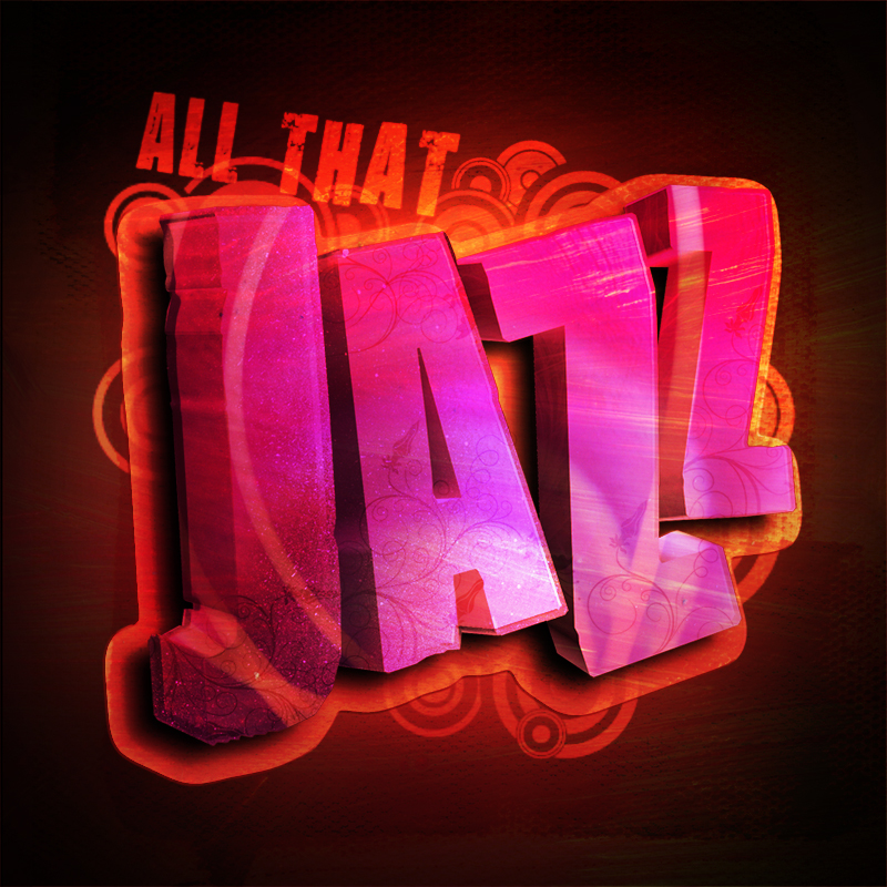
I've been playing this ''graffiti'' inspired style on a few things over the summer, trying to get a feel for how to produce it and the techniques involved but that's all been 2D based work. What I like here was the inclusion of 3D and 2D elements.

So I thought I'd have a crack at it myself. I new I would need to get a model of some 3D text, which at first I was going to render out and the edit in photoshop. But then I remembered reading about the new 3D layer and object tools in Photoshop Extended. These enable you to import OBJ files into Photoshop.

So I set about finding a nice font, and writing the word Jazz. (Only for the reason, Jazz it a very expressive type of music and therefore could be visualy interstinginteresting, also the song that I was listening to at the time was ''All That Jazz'' by DJ Fresh :)


I then converted into a Illustrator path and imported it into Maya. Once in Maya I turned the curves into a polygon. Changed the angle and size of the letters to create more dynamics. At this point I had to find a plug-in so that I could export the model to a OBJ format. I found one of those Here for FREE !


Once I had the model I jumped onto adobe's video tutorial site and looked at the a video on the
new 3D features so I didn't miss anything. I then went ahead and and imported the model into photoshop.

Once I had it in photshop you can select the new 3D layer tool and manipulate the model in 3D space add, light and choose the render display mode, all whilst working with the familiar tools off photoshop.


I repositioned the model to where I wanted it and began work on bringing it to life. I applied the
first bit of colouring by selecting each letter and painting with a paint spray brush from computer arts magazine. I then duplicated the letters and shrunk them etch, to create the illusion of a glass like material. I also made sure that each letter was now on a different layer just to maximise my options.


After I had the text looking the way I wanted it to, I began work on the background. This consisted of a black with a centre gradient of light yellow. Then above everything was a layer with grimy brushes strokes on it which was coloured and then set to ''overlay'' this gives the image that Mediterranean warmth.


Another couple of textured layers were added in a similar way to give the image more depth. Then some light swirls were projected onto the text as well with some textured canvas underneath it all.


Again a few more light layers were added and some subtle highlighting and shading. Behind the text I added a collection of swirls and circles I'd drawn in illustrator, then converted into Photoshop brushes. Also on the text itself I applied small ornate decoration, containg flowers and swirls. These were all cut to the shape of the letters and set to ''overlay''.


Finally I added the text ''ALL THAT'' (like the song) and a outer glow/shadow created by duplicating the text, filling it and reshaping it.


You can find a bigger version Here.