Friday, 8 May 2009
Studio AKA
Studio AKA
Another company we visited in London was Studio AKA. They are one of the counties top animation companies. There client list is extremely impressive it includes, Llyods TSB, ITV, BMW, H Samuel, and Peperami. We watch their newest film which has been created purely to promote the work they do at the studio. It is called Varmints and is probably the spectacular animation I have watch in ages. Its very aestheticly drawing, and the story is amazing. Its based on a book written and illustrated by one of the directors who works at Studio AKA. The story is very dark and is defiantly not aimed at children, and shows that animation isn't just a colourful kids medium, its a series medium to tell a story.
Double Negative
Double Negative
When we went to London we were lucky enough to take a trip into one of the worlds leading visual FX companies, Double Negative. I have been watching DN's work for a while now as visual effects in films has always interested me since I watched Jurassic Park for the first time in 1993. Jurassic park contained the first photo realistic characters in a feature length film. Since that I have been avidly looking at all different types of visual effects and it didn't take me long to come across Double Negative.
When we went into the see them I was really surprised at the size of the place, the girl who was taking us round said they employed over 500 people there. This sounds a lot but when you consider the size of the briefs they get assigned you can understand why they have that many people working their.
Walking round the building we saw room after room of computer filled offices all with five to seven people in them all with Maya on the their screens. We also got to the rendering farm, which was HUGE. They also showed us their show reel and then a in depth video explaining the work they did on the Dark Knight, a film that I had watch a lot recently and was in ore of the work involved in it. So to see scenes pulled apart and explained to us was amazing. One of the things that I had never picked up on was the amount of work that is done in the background of scenes, There are so many scenes in the city of Gothem, that you would believe were real if you weren't shown differently.
The Sancho Plan
The Sancho Plan is a live performance show involving animation and the use of Midi instruments to trigger visuals and sound. I found this really amazing not just because it looks brilliant but because I've worked a bit with Midi triggering I can appreciate the amount of time it has taken and the amount of ingenuity to get everything to work together as one. I love the way they have thought about bringing something to an audience that isn't just music or its just watching a film, the combination of the two is incredible and a really creative way to engage a audience. Added to that, its all 'played' live by hitting electric drums makes it even more original.
See the web site Here
Tal Rosner Vs Tracey Kendall
For the comparison to tow practitioners I have chosen Motion Graphics artist and designer Tal Rosner and Textiles and Space Artist Tracy Kendall. My reason for choosing these two is that they come from complete opposite ends of the create world more of less.
To begin with I think it is important to say that both people come from not to dis similar backgrounds. They had a love of art and perused this by taking a coarse at a art college. This seems to be the beginning of a lot of designers and defiantly a starting sentence from nearly all the guest lectures we have had visit us at Stockport.
One thing to bare in mind at the stage is the age difference between Tal and Tracy. Tracy is a fair bit older than Tal had and started creating and deigning way before Tal's medium even existed. This fact alone already starts picking out the differences between the two and it goes to show that Art and Design coarse have been around for years but its what's current and fresh that has an effect on what new designers will become. Who's to say that if computer technology was what is today when Tracy was studying she might have been a motion graphics artist like Tal.
Comparing someone who makes abstract films to a world class wallpaper designer may seem a little strange as there are a lot of differences between the two and they do seem a world apart. However there are lot of similarities as well within their work.
Tal films the world around him, searching and looking for interesting visual statements with the urban environment in which we inhabit. He goes to the most depressing and mundane places within the urban sprawl of London and find the most amazing visuals. It's only when you take something out of its original context and apply it to something new like Tal does, does it take new and exciting meaning. Tracy as well works in a not to different way. She takes not photos and footage but items themselves, real objects considered to be boring or not important. Taking these and reapplying them to a wallpaper design, all the objects work together as one visual message that is much more than just buttons glued on paper, or in Tal's case footage of a industrial estate. Through their creative process however different their idea and ethos I think remains very similar.
Another thing to consider when talking about Tal and Tracy's work is the colour pallet used by both of them. In Tracy's lecture she mentions that she used black and white a lot as it is a masculine colour and as nearly all the architectures and clients she has buying and looking at her work, it makes sense to her to appeal to them. If we take that idea and look at some of Tal's work Such as Doppelgänger then we see that minimalist approach to colour, is for a design or is a built in appeal for men to like those colours and therefore use them and find them visually pleasing.
This leads me onto to their working practice in regards to clients and running a business and at the end of the day how make money. Tracy clearly loves what she does as not only does she just create her wallpapers for purely commercial purposes but she exhibits them as art in galleries. However underling this the fact that what she does make is sold for massive amount s money, and she did quote some figures in the lecture which were jaw dropping. It makes me wonder if she wasn't making the amount of money she does would she have another job and still push her wall paper as art. My thoughts are that she wouldn't, Tracy came across in the lecture as having a very instinctive business mind, and talked lot of about her clients and sub contractors leaning me to think at least that she runs a very successfully company and turns a good profit, however I do think she thinks of her wallpaper more as a job than a creative release.
On the other hand Tal is the opposite. To peruse what he wanted to do he had to leave a well paid job in post production and take a gamble on his own ideas and he very much treats hid work as personal projects in which he can pour is style and creativity into, no matter how big or small the client or if there isn't a client at all. Tal came across in his lecture as a very reserved character, he didn't say a great deal but what he did say was very insightful. He draws you in as being this enigma that everyone wants to understand and get inside his head, but I doubt he even shares his creative secrets with his closest friends. For Tal taking a chance and producing the work he wants and gaining complete creative control (apart from the clients decisions) has paid off, and he now creates the work he loves and earns money for it. Not only that he has done work for some very large clients such as channel 4. Tracy as well has achieved that great position in life where your doing what you love and getting paid for it. I think with Tracy the client comes first and she is always thinking of new ways to get her product out there, and she genuinely enjoys every aspect of her work.
Both Tracy and Tal have done what I think every student dreams of doing..... exactly what they want and getting paid for it, and I think they have proven that anyone can do it no matter what your speciality is as long as your demerited and put the work in.
Wednesday, 6 May 2009
Funnel design group
This a design company I found on the web, and I wasnt that interested in their work, what was overwheled by the creative, interactive and original web site they have.
Thery're based in the US and deal with Print based graphics, interactive web sites (oviosly) coorperate identitys and much more.
The web site really draws you into it, with the use of nostalgic colours and textures and 1940s music. All this in mind it doesn't seem dated.
Thje site is a nice refreshment from all the super slick minamalistic web pages that design companies usualy have.
Which can be found Here
Grant Gillbert
Grant Gillbert is a motion graphics artist who we were lucky enough to have as a lecturer this year.
He started out doing the same coarse as I did a ND in graphics at Stockport College then moved to Birmingham to do his degree. His fist job career wise was on Channel 4 creating title sequences and promo/bumpers. He spent a short time in New York until coming back to go freelance in this country which he has continued to presume till this day under the name of Double G Studios.
Unlike a lot of freelancers Grant owns Double G Studios as a LTD business which is a interesting and more professional way of setting your self up as a freelancer, rather than just using your own name.
However when I visited Main Frame in London, my class mates and I were advised against using a company name for yourself if you are planning to try and get work in a larger company. It's something that thought to take note as the current economic climate doesn't allow for business mistakes, no matter how good your work is.
Back to Grants work, I found his list of clients very impressive and the work that that he produced even more so. It was nice to see a small company getting big clients and the work still looking top notch.
Tuesday, 5 May 2009
Serial Cut
I found this image making company using the trusty 'Stubble'' button again. They get commissioned to create there own style of super slick graphical imagery for a variety of clients.
This is one of there newest pieces. It's a pop up book created for Renfe’s new campaign advertising there brand new fleet of trains. What is nice about this image is that it actually exists there's no 3D or Photoshop its acutely been made then photographed in a studio.
I always get a bit of a kick when I know some thing has been done for real, such as the Sony Brava adverts with the plasticine rabbits. This is on a much smaller scale but it's still nice to know that the computer does get left of the equation sometimes.
This is a motion graphics piece for the 2009 MTV winter events. I really like the smoothness and the use of space in this little animation. The lack of things going on really makes it flow, rather than a really in your face over the top piece of motion Graphics.
Craig Ward
Craig Ward is a London based designer who concentrates on typography within his work. He has featured in computer arts, Creative review and done front covers for both. He uses a variety of materials and methods from letter press to 3D
I always find type fascinating, and Craig's work draws me into and inspires type creation of my own.
His portfolio can be found Here
these a couple examples of his work.
I always find type fascinating, and Craig's work draws me into and inspires type creation of my own.
His portfolio can be found Here
these a couple examples of his work.
Tracy Kendall
Tracy Kendall designs and makes exclusive wallpapers. She comes from a textile background and used to teach textiles as a degree at the Royal college of Art and help out as a tech support for them as well.
Her work nowadays mainly consists of designer wall paper, that gets commissioned by various people for all sort of applications. It is unique in the way it all hand made and individual. She employs a huge range of materials and techniques to achieve the results she get.
She started using the big presses at the Royal College to make her work. Her first design she showed us was of a floor to ceiling knife, fork and spoon to go in her kitchen. From selling that design she moved onto weird ways of embossing and texturing the paper such as sewing buttons and sequins into the paper, cutting stapling and ripping it to get the desired effect.
She said she never really plans a design, it just springs out of inspiration and that can come from anywhere.
Tracy also has put on exhibitions of her work, using the space in galleries to hang her wallpaper more like art than a practical way of covering the plaster on the wall.
I found her work very interesting especially where she had transferred her designs and ideas onto furniture such chairs and lamp shades.
Damian Gascoigne
Damian Gascoigne is a Illustrator/Animator. He is currently teaching at a Kingston University.
When Damian began his lecture for us he instantly drew you in as being a genuine person with a brilliant sense of humour. The lecture was extremely informative and entertaining. He a great out look on his work and how other people should look at their work.
One of the things that stuck in my head about the lecture was when he was talking about always being alert and looking for inspiration. He showed us a picture of some milk/paint and a fag dimp on the floor that he saw at the train station. When he turned it round it looked it looked like a goose.
Another aspect to this always being a aware, was he said he takes pictures of everything and always has a sketch book with him. The reason for this is a lot of the characters he creates for in his animations are taken from real life.
After the lecture I was lucky enough to spend 20minutes talking to Damian about my Final Major Project. I talked him through the problem that I had chosen to solve, and the two ideas that I had narrowed it down to. He very quickly pointed me in the direction that I needed to take the project and gave a lot of inspiration and drive to go and get on with it.
These are some stills from his piece. 'Careful'
Tal Rosner
One of my favourite guest lecturers from the past year has been Tal Rosner.
Tal is a Graphic designer come film maker most noted for his recent work on the title sequence Channel 4s TV series Skins. There was a couple of things that I liked about Tal that made him stand out more from the other lectures I have attended. Firstly was his how he has arrived at what he does now. He studied at St Martins College and ended up working for a large post production company. It was here that he felt the desire to regain some creative control over the work he was producing. He described it was being on a assembly line, and even though the finished product was usual something really impressive he felt it wasn't personal to him.
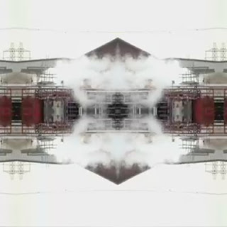
Like a lot of my class members I really admire Tal's motion graphics piece Doppelgänger.
What draws me to it is they way you can get completely lost in the movement and the way the sound interacts with the visuals.
Another great thing about it is the way it has been created, by taking footage at the front of a train then manipulating it from there. This results in a very urbanised look and feel to the piece.
Here are some stills from the piece.
Feist, 1, 2, 3, 4
This is a small budget music video I came across directed by Patrick daughters. The look of the video does seem a bit cheap and nasty at the beginning but as the video progresses you get drawn in by this continuous camera shot with know edits. It just follows some really well organised coriography.
Lynn Fox - Audi ''Lines''
I came accross director Lynn Fox's work on the website for a campany called BlunkProductions
Blink productions are as the name suggests, a production company. They are based in London and work in a very similar way to Studio AKA, where they have lots of directors all with different talents and styles who are located different projects depending on what the client wants.
This is one of my favourite adverts in the last few years. just plainly because of its simplicity. I really think the idea of the advert works especially well due to its simplicity.
Seven Deadly Glasses
I found these glasses on a design news site called Yatzer.com. They are designed by Kacper Hamilton and based around the theme of the Seven Deadly sins
What caught my eye is the way the designer has captured the idea of each sin in each glass. It's clear they have really thought about how to portray the sin through the shape of the glass.
To see bigger pics click Here
Nozon
Nozon are a Visual FX and Animation company from Brussels. They have a broad range of work as the show reel below demonstrates. They are a one of Europes best new and upcoming studio and what I like peticularly is the quality of the character animation.
The aesthetics in the Hamster animation is easily as good as a pixar short and their visual FX work is world class.
See the Website Here
Shy the Sun
Shy The Sun are a slightly off the wall motion graphics and animation company from South Africa. They are only three strong but just like Dvien create very impressive work with very few people. What caught my eye about them was unusual look and appearance of there work. There mythological influences are very evident.
Being musically backgrounded I found this piece 'Sea Orchestra' very interesting. I love the way they have brought out the moment of the notes within the animation and the style is like that of a old painting that has been brought to life.
Tuesday, 28 April 2009
Subprime by Mike Winkelmann
Mike Winkelmann is currently a graphic designer from the US, I found this animation searching Vimeo. I like that it reflects current issues in the USA concerning the housing market. Also the influence from pixel art is very clear and the way it as been brought to like is very effective.
The music was created by a sound design company called Standing Wave
they are a sound company that specialises in creating digital based production music for a variety of applications.
I think they were chosen for this animation as the minimalistic digital music compliments the simple aesthetics of the animation.
subprime from beeple on Vimeo.
Bart Hess
Studio Liddel
See the Website Here
Studio Liddel are a animation company based in Manchester. I first heard of these guys through a friend who said I could have some work experience there. Unfortunately she is very ill at the moment so I going to wait till she gets better before I reminder her about it.
What attracts me to Liddel is the range of 3D work they under take. It goes from Children's TV's cartoons to hype realistic design work. Another big part of there work which I'm interested in as something I wouldn't mind doing in regards to freelance work is 3D visualisations of buildings, events, products etc.
They are also involved in various pieces of graphics work, which is usually related to the animation work they do.
Monday, 27 April 2009
Big or Small jobs for all?
I have chosen to talk about this design issue as it relates very well to a company called Fresh who I have recently been in contact with.
Fresh is a design and event company based in Cheadle. They specialise in large corporate functions and events, and are in the process of opening a in house advertising agency as well as the six other existing departments Events, Design, Video, Interactive, Broadcast and Rewards.
Fresh's creative design team are a really good example of a large company who employees al large number specialist people who are particularity skilled in one area of the creative process.
For them this works very well as the creative team deal with a multitude of different requirements, that all differ from on another, therefore requiring specialist skills in lots of different areas. They employ Graphic designers, Web designers, Editors, Illustrators, 3D Designers, Art Directors, and Film-makers all with different areas of expertise within there field. This creates a highly talented and effective team of people that can deal with all manors of requirements.
Another plus point is that working around people with all sorts of skills and different jobs going on creates a buzzing environment of interest for everyone who works there.
I imagine it is not to dissimulator to the way that everyone in my class works on very different things and all have different skills, opening up ideas to you that you wouldn't of usually come across if you hadn't shared your thoughts with someone working in a completely different format to yourself.
In a company one of the downfalls of having lots of people only doing 'their thing' results in periods where there isn't any work for one person but too much for another, as he or she only has the skills to complete that given task. Fresh gets round some of this like a lot of companies, by hiring freelancers to come in for a few days. As a result this cuts down on paying people to wait around for the other person to finish there part of the job before for he or she can do theirs.
Working in a large office for a large company, with a vast variety of talent surrounding you must be very inspiring. However in the case of really big companies such as Double Negative which has in excess of 500 people working there, it is a slightly different state of affairs. They produce special effects for big budget Hollywood blockbusters. The jobs are so enormous that they to to employ teams of people specialised in one area to get through the work load. In this situation I think it maybe a little less inspiring sitting in an office where everybody does the same job, and you have to go next door to find another skill or stage of development with another 10 people in there doing that job.
In contrast to this, a small company in Altrincham called 'The Foundry Communications' (where I had some work experience a few years back) work in a completely different way. They are a Advertising Agency that does a small amount of web work. There clients include, John Smiths, Manchester United, and Scholl. Their way of working is to hire people who have a range of skills under there belt and have worked in various areas of design and web design.
The company employs around 20 people, and they all help out on everything all day. Watching the way they worked was really interesting and after a week there I began to realise why they could do these quick turnarounds and make ridiculous deadlines. It's because they were always helping each other and running round from one part of the office to another, they managed to turn the company in a fast passed machine where somebody always had something to do, or someone was always helping someone else. The environment was very close knit and the staff were more like family than colleges. However this can sometimes result in there not being the skills in house to complete a job, in this case they would hire freelancers. This is costly and in many cases can delay the progression of a job.
In regards to looking at what my preference would be between having a assigned task to do or being in a situation where you get to work on a variety of things, and think id have to opt for the later. I love a lot of different things, and enjoy working in different mediums to achieve different tasks. I'm not sure I like the idea of doing the same job day in day out, even though the brief might be different Id always feel like I have more to offer and more to learn that doing one allocated task very well.
Big Yellow
Big Yellow
I was also puzzled by how they could done it and to my joy I found there was a making of it which is below.
I think it is a very interesting and exciting solution to some what mundane product/company.
I came across this on Youtube one evening. Its is an advert for Big Yellow Self Storage created by Blink Productions who are a team of directors and artist who specialise in off the wall ideas that some companies wouldn't embark on. What took me about it was the of coarse the stop-frame technique and how effective the sound effects were.
I was also puzzled by how they could done it and to my joy I found there was a making of it which is below.
I think it is a very interesting and exciting solution to some what mundane product/company.
Thursday, 16 April 2009
Dvein
Dvien are a motion graphics and interactive company in Barcelona which upon my visit there in November I had the fortune to go and see.
They have a large client list and are highly regarded world wide as one of the best in there field, which is a an amazing thing considering there is only a couple of them working there.
On the visit I found the attitude was really relaxed and informal, taking into account the jobs that they do there this was surprising to me as I thought the amount of pressure on such a small company would be evident.
We were given a talk about the what they do, there company ethos and the reason they wanted to set up the company in first place.
I found this little piece of text in there 'about' section on the web site.
''We love animation, we love design, we love illustration, we love coding, photography, film making, modelling, drawing, painting, cooking, sewing, sleeping, gaming and lots more*ings*
I think this sums up the company very well as there influences come from all over yet the studio defiantly has its own 'in house' style.
We also got to see there show reel as well, which was stunning and one of the few show reels that I have seen which a piece of audio specificly designed for it. This resulted in the Show reel being a piece of work in it's self that captivates you with all these amazing visuals.
One of the things that I was surprised at was the method in which they storyboarded things and came up with ideas. We were show a first story board that contained frames that were used in the end product, resulting in the storyboards themselves being finished to a very high standard. This is in very stark contrast to the way I work or the way I have seen others work.
One of the things that caught my attention about Dvein's work was the fluid aspects. This was mentioned in the talk and we were told about how they experimented with melting plastic and wax to create there footage and effects. So when I got back I had a go my self with a heat gun and a collection of plastic bags.
Here is a couple of examples of what I came up with
Dvein's webpage can be found here
Pete Harrison
Pete Harrison is a freelance designer working in London, he creative identity is know as 'Aeiko' and has appeared in computer arts magazine a few times,s featuring tutorials. (this is where I found out about him). His clients include; Peugoet, Intel, D&G and Deviant art to name but a few.
I find his work, a source of influence and inspiration, not just visually but technically as well. The use of busy composition's and new age type, brings a look and feel that is very distinctive to his work.
His web Site can be found here
Since he made his first appearance in CM magazine, I have noticed his influence reaching poster and flyer design, promoting night clubs and DJ's
He has influenced some of my recent work, when I was asked to create some promo artwork for a Drum and Bass DJ called 'Raw Deal'
I have taken small elements of what I have seen in Pete's work and the techniques I have learnt by doing his tutorial and created this.
I find his work, a source of influence and inspiration, not just visually but technically as well. The use of busy composition's and new age type, brings a look and feel that is very distinctive to his work.
His web Site can be found here
Since he made his first appearance in CM magazine, I have noticed his influence reaching poster and flyer design, promoting night clubs and DJ's
He has influenced some of my recent work, when I was asked to create some promo artwork for a Drum and Bass DJ called 'Raw Deal'
I have taken small elements of what I have seen in Pete's work and the techniques I have learnt by doing his tutorial and created this.
Tuesday, 24 February 2009
Photoshop Lighting Effects
Pete Harrison
I recently came across a tutorial from an artist who I had already heard of and admired called Pete Harrison. The tutorial apparently appeared in Digital Art Magazine but I found it HERE on there webpage.
The end result of the tutorial was this.
So I searched out some stock photography from Deviant art and began following the general idea of the process evolved, still interoperating in my own ideas and techniques I already learnt.
Before
After
To See larger Click HERE
I am going to continue with other such tutorials as I believe I am gaining valuable skills that I might one day use in my own work. I the case of this one it ended up on a poster.
To see larger Click HERE
British Gas TV Advert 'planet earth'
See the video HERE
I saw the new British Gas advert the other day and it stood out to me immeadetly as I have been on the look out for adverts and campaigns that are answered in the medium of animation to support research work in my final major project.
The advert is promoting the involvement of British Gas in trying to use renewable energy sources as a means or generating power.(baring in mind you can now get your electricity from them as well as gas)
I think the advert has been created as a animation to try and make a pretty dull company and concept more appealing to a younger audience, perhaps first time home owners who have a more fresh opinion on saving the planet than a couple in their 70s. British Gas has used animation before with their 'Blue Flame' characters. (Below)for a similar I suspect.
My favourite part about the whole advert is the process in which it has been produced. I have a keen interest in 'model making' or 'scale set design/construction' this came from my love of Aardman Animation's work and Tim Burton's 'The Corpse Bride'.
Director Guilherme Marcondes had all of the set made from hand and suspended in front of a green screen.
The Wind Mill planet made by animating clay.
Filming the models with the special Stop-Motion 35mm cameras.
Monday, 23 February 2009
Karni & Saul
Karni & Saul a creative team, and couple. Saul is originally an animator/director, and Karni a photographer/director. They are based in London and have been working together since 2004.
All their work has a very distinct style. It's very grimy and dirty aesthetically and has some real raw qualities. Looking through their portfolio there are two pieces of work that stand out to be more unique than the other ones.
The first one is called 'Float' and it is a music video for a Irish/American Celtic Punk band called Flogging Molly.
What I like about this is the motion and rhythm carried and portrayed through the movement of the character. The way in which it depicts the lyrics of the songs is also very unique as it doesn't do it directly, it just hints at it.
The second is called 'The Red Suitcase' which for me is all about the brilliant narration of the story by the voice over. The stylised world the characters are in really appeals to me as well. Like the first one it has a grimy dirty look to it even though it is 3D, which is generally associated with slick looking animation.
999 Design
See the website
999 Design are based in three location across the country, London, Manchester and Glasgow. I have known about the company since before starting college as my Father used to freelance for them. As a result of this I always have had the opportunity to see what there working on before the public sees it, and taking into account there client list (Below) this is always very interesting.
In my second year I contacted two of there employees in the Manchester branch in Deans gate locks as part of my log book reports. Dave Sedgwick, designer and James Buckley senior designer. They were extremely helpful in filling out a short questionnaire I sent them and it was an interesting insight into the minds of two successful designers.
Since then I have have kept an eye on there work and these are a couple of pieces I really think have some really nice ideas behind them.
Gleneagles Natural Mineral Water
This is a piece or product packaging done for Gleneagles Natural Mineral Water. Not only is the bottle a beautiful slick ergonomic design but the whole thing is completed by the minimalistic logo. I love they way the the bottom of the 'G' ripples like water giving the logo a real visual taste of the product. The shapes and colours all conertate ideas of freshness and purity.
What About Me? Website
This project was to create a website for a TV show called 'What about me?'. It consists of two musicians going round the world and recording a song by taking a piece of music or a beat to a person and saying now add your bit, the continuing this process all around the globe. It takes them on journey in which they discover the worlds issues and problems all represented and dealt with by musical talent from every background.
See the site here
What I like about this website is the unity of the world that is represented by the interface, of giant world made up from a series of TV screens. The way in which the screens interact with the curser is also very inviting as is the ever changing content of the 'unclickable' screens.
It is a very easy website to use and has a lot of content if you want it or less if you just want to get an idea of what 'what about me?' is all about.
Subscribe to:
Posts (Atom)